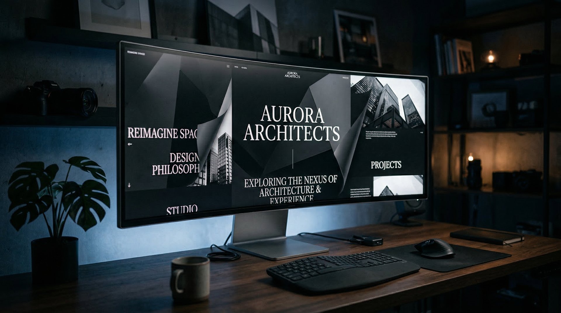
Every January, design Twitter loses its mind over the same recycled predictions. Glassmorphism is back. Brutalism is in. Dark mode is mandatory. And every January, none of it matters to the plumber in Toms River who just needs his phone to ring more.
We build websites for small businesses every day. Here's what we're actually seeing change this year.
Your site is probably too slow, and it matters more than it used to
Google's been talking about page speed for years, and most people tuned it out. Fair enough. But something shifted recently — with AI Overviews eating up a huge chunk of search results now, the pages that do get clicked are competing against a quick AI-generated answer sitting right there at the top. If your site takes 3-4 seconds to load, people just go back and read the AI summary instead.
We've seen this play out with client sites. One contractor we work with had a WordPress theme running 28 plugins. Page load was around 4 seconds on mobile. We rebuilt it on a modern stack — same content, same branding — and load time dropped to under a second. Leads from organic search went up about 30% within two months. Nothing else changed.
The ugly truth is that most WordPress themes with page builders are carrying a ton of bloat. That's not a knock on WordPress itself, but if your site is built on Elementor with a dozen add-ons, the math on speed just doesn't work anymore.
The template look is starting to hurt
You know the layout. Big hero image, three service cards in a grid, "Why Choose Us" section, some testimonials, footer. You've seen it because every template on ThemeForest and Squarespace follows the same formula.
It didn't used to matter much. But now when someone searches for "roof repair near me" and opens three or four tabs, they're looking at the same site three or four times with different logos. Nobody remembers which company was which. The sites just blur together. This has gotten worse as AI builders push everyone toward the same default layout, which is why every AI-built website looks the same and why standing out is now the whole game.
What we've noticed working with clients across different industries is that the sites that actually stick in someone's head have a personality. We built a site for a cleaning company recently that feels more like a high-end spa brand than a cleaning service. That sounds weird, but it works — it immediately signals "we're not the cheapest option, and that's the point." The design does the selling before anyone reads a single word.
You don't need a $50k custom build to have a point of view. But the approach of buying a $500 template, swapping in your logo, and calling it done? That's actively working against you now.
Scroll-driven animation went from gimmick to expectation
This one surprised us a little. CSS scroll-driven animations landed in browsers over the past year, and they've changed what "normal" looks like on the web. Parallax effects, elements fading in as you scroll, smooth transitions between sections — stuff that used to require heavy JavaScript libraries now works natively in the browser.
Why that matters for a small business: people don't scroll through boring pages. They just don't. A static page with walls of text gives nobody a reason to keep going. But add some well-placed motion — a hero image that dissolves into your portfolio, service descriptions that slide into view as you reach them — and suddenly people are actually engaging with the page long enough to read your pitch and hit the contact form.
The trap is going overboard. We've all seen those sites where everything bounces and spins and it feels like someone discovered After Effects for the first time. The good version of this is picking one idea and sticking with it throughout the page. Maybe the whole experience feels like you're moving through a space, or layers are peeling back to reveal information. One clear concept executed well beats twenty random animations scattered around.
Fonts matter way more than people realize
Here's a quick way to spot a template site: it's using Inter or Roboto. There's nothing wrong with those fonts. They're clean, they're readable. But they're on millions of websites, so they effectively communicate nothing about who you are.
Google Fonts has gotten really good in the last couple years. Variable fonts, tons of new families, stuff that would've cost hundreds in licensing fees not long ago. A construction company running a heavy slab serif feels completely different from a law firm with a sharp editorial sans-serif. That font pairing alone — before anyone reads a single word — tells visitors whether you're premium or budget, established or scrappy.
We've started treating typography as one of the first decisions in every project, not an afterthought. It sets the whole tone.
Mobile still gets treated like an afterthought (and it shows)
This shouldn't still be a problem in 2026, but it is. Most small business sites get built on a desktop screen and then the developer checks it on their phone, does some quick fixes, and ships it. The result is always the same — tiny buttons, text you have to pinch to read, contact forms with input fields the size of a fingernail.
Try this right now: pull up your business website on your phone. Find your phone number. How long did that take? Now navigate to your services page. Now try to fill out the contact form with one hand. If any of that felt annoying, your potential customers feel the same way — and they're leaving.
Building mobile-first — meaning the phone layout is designed first, and the desktop version expands from there — sounds like a small distinction but it changes everything. Navigation that works with your thumb. Phone numbers you can tap to call. Forms with big input fields. Information you need right away visible without scrolling.
Dark mode isn't just for tech people anymore
Over 80% of smartphone users run dark mode. When someone browsing their phone at 10 PM hits your site and gets blasted with a pure white background, it's not a great experience. A few lines of CSS can detect the user's system preference and tone things down automatically — darker backgrounds, adjusted contrast, dimmed images. It's not a lot of work, but it shows you're paying attention.
So what actually matters?
Forget the trend pieces. If you run a small business and your website needs to bring in leads, here's the short list:
Your site needs to load fast — under 2 seconds on a phone. It needs to look like your business, not a template with your logo pasted on. Some tasteful motion goes a long way toward keeping people on the page. Your fonts should match the personality of your brand. And the mobile experience shouldn't feel like an afterthought, because for most of your visitors, it's the only experience.
That's it. None of this is flashy or bleeding-edge. It's just what actually works right now.
We build all of this into every site we do at Current Digital. If your website is basically a template with your logo dropped in, we should probably talk.